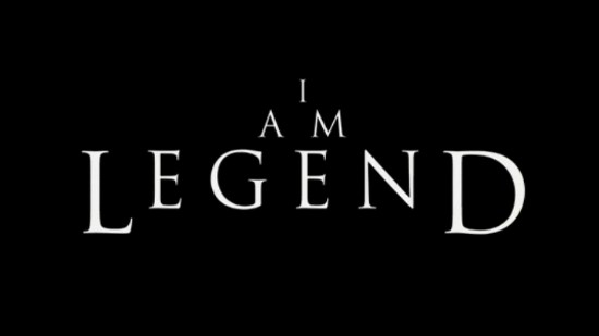
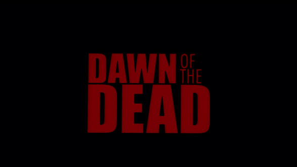

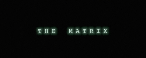
Its a common feature for film titles of this genre to be simple text against a black background. The colour of the text implies different things about the plot.
White text indicates a struggle overcome. Red suggests danger. The title of War of The Worlds has orange and yellow text which brings to mind images of fire and burning/ destruction. The matrix title is glowing pale green to link back to the computer themes within.
No comments:
Post a Comment